 capital
: ASTANA (Note : the inscription
is written in Latin since 2022)
capital
: ASTANA (Note : the inscription
is written in Latin since 2022)slavery unit : tenge tongues : Kazak + Russian 20000000 idiot monkeys on 2720000 km²
puke
sects : muslim 70% X 17%
pagan 13%
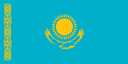
Light blue is the traditional color of the peoples of former Turkestan (includin also the now Chinese Sin Kiang), of Mongolia & lots of Siberian peoples in Russia. It stands for the sky. The silhouette of the steppe eagle (or berkut) & the sun symbolize the lofty aspirations of the Kazaks. The sun has 32 rays for the 32 Kazak native nationalities. The 32 rays are shaped like grain which is the basis of abundance and prosperity. The dezign (frise) to the hoist is a national ornamentation. Its local name is Koshkar Muiz which means "Horn of the Ram" in Kazak. The present pattern was adopted on 6 JUNE 1992.
capital
: ASTANA (Note : the inscription
is written in Latin since 2022)


1992
(independence
1991) (sovietic ratio of shit)
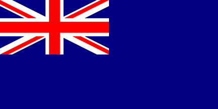
state ensign
(British homage of shit !!!!)
British Blue
Ensign - state ensign


naval ensign (sovietic homage of
shit !!!!)
(fascist naval 1950)
MARKO's
project for a NON sovietic homage of shit naval ensign
KAZAKSTAN's Shaken Niyazbekov is one of the MOST BEAUTIFUL flagz on Planet Earth but they give homage both toward soviet & british shit...
I just can NOT understand.
 fascist
1955 (hammer & sickle redezigned)
fascist
1955 (hammer & sickle redezigned)
 fascist
1953 (new flag)
fascist
1953 (new flag)
 fascist
1940 (Қазақ Советтік Социалистік Республикасы)
fascist
1940 (Қазақ Советтік Социалистік Республикасы)
 fascist
1936 (Qazaq Sovettik Sotsialistik Respoublikasy -
separated from the RSFSR)
(flag changed only in 1937)
fascist
1936 (Qazaq Sovettik Sotsialistik Respoublikasy -
separated from the RSFSR)
(flag changed only in 1937)
 fascist
1925 (Kazak Autonomous Soviet Socialist Republic -
part of the RSFSR)
fascist
1925 (Kazak Autonomous Soviet Socialist Republic -
part of the RSFSR)
 fascist
1920's alternate flag (In 1924 Central Executive
Committee decides to prohibit "any flags of unestablished forms"
with abbreviations in Russian and Arabic)
fascist
1920's alternate flag (In 1924 Central Executive
Committee decides to prohibit "any flags of unestablished forms"
with abbreviations in Russian and Arabic)
 fascist
1920 (KCCP = Kirghiz Soviet Socialist Republic -
Notice "Kirghiz" matches from 1920 to 1925 with nowadays
Kazakstan, not with nowadays Kirghizia !!!!)
fascist
1920 (KCCP = Kirghiz Soviet Socialist Republic -
Notice "Kirghiz" matches from 1920 to 1925 with nowadays
Kazakstan, not with nowadays Kirghizia !!!!)
 1917 (Alash Autonomy, provisional Kazak government
ruled by Alash Orda political party - Government in
exile from 1918 to 1920) ("Alash Orda" means "Kazak Horde"
in Kazak)
1917 (Alash Autonomy, provisional Kazak government
ruled by Alash Orda political party - Government in
exile from 1918 to 1920) ("Alash Orda" means "Kazak Horde"
in Kazak)
 colonial
1914
colonial
1914
 (detail)
 (enhanced)
 colonial
1883
colonial
1883
 colonial
1858
colonial
1858
 colonial
1847 (Russia)
colonial
1847 (Russia)
 1456
(Kazak Khanate)
1456
(Kazak Khanate)
 1368
(Golden Horde)
1368
(Golden Horde)
 1218
(Empire of Genghis Khan)
1218
(Empire of Genghis Khan)
 1077 (Khwarezm Empire)
 840 (Kara-Khanid Khanate)
 744 (Uyghur Khaganate)
 552 (Göktürk Empire)
 408 (Hephthalite or "White Huns"
Empire) (Notice the Hephthalites should not be
called White Huns.)
408 (Hephthalite or "White Huns"
Empire) (Notice the Hephthalites should not be
called White Huns.)
 204
BC (Great Hun Empire)
204
BC (Great Hun Empire)


+ ALMATY
SPECIAL MUNICIPALITY
+ ASTANA SPECIAL MUNICIPALITY
+ SHYMKENT SPECIAL MUNICIPALITY


+
BAIKONUR RUSSIAN ENCLAVE
+ BAIKONUR MARKO's project as a flag
with the name of the country / city / State on it is A FAILURE.
I kept the fckn soviet ratio 1:2 of shit only for the display.
 ALMATY's flag loox MORE "VIZIBLE" that way..........
+ ALMATY
SPECIAL MUNICIPALITY MARKO's project
 I found it MUCH
MORE elegant this way....
I found it MUCH
MORE elegant this way....
MARKO's project for a """new""" seal of ALMATY SPECIAL MUNICIPALITY - It's maybe just only an idea of shit but I REALY DO THINK the red text-&-stuf LOOX VERY "HEAVY"....
ALMATY's seal loox MORE "LIGHTER" that way..........

 Arrrrghhhh !!!!
RUSSIAN AEROSPACE FORCES since
2015
+ ASTANA MARKO's project as
I find ASTANA FLAG VERY UGLY with ALL thoze sun rays, and it
loox TOO MUCH
like the RUSSIAN
AEROSPACE FORCES !!!!
RUSSIAN AEROSPACE FORCES flag loox very
good....
....but ASTANA's one with
TOO MANY sunrays loox definitely ugly.
 This was ASTANA 1998-2008. I
REALY LOVE THIS FLAG.
This was ASTANA 1998-2008. I
REALY LOVE THIS FLAG.
 This was ASTANA 2008-2019 with the name written in Cyrillik.
 This was NUR-SULTAN (ASTANA)
2019-2022 with the name
NUR-SULTAN written in
Latin.
This was NUR-SULTAN (ASTANA)
2019-2022 with the name
NUR-SULTAN written in
Latin.
This is ASTANA since 2022 with the name ASTANA written in Latin. I REALY DO NOT
LOVE THIS FLAG !!!!


 + SIGIS KAZAKSTAN AUTONOMOUS REGION
+ ALMATY
SPECIAL MUNICIPALITY
+ SHYMKENT SPECIAL MUNICIPALITY
+
BAIKONUR RUSSIAN ENCLAVE
+ BAIKONUR MARKO's project as a flag
with the name of the country / city / State on it is A FAILURE.
I kept the fckn soviet ratio 1:2 of shit only for the display.

 PROJECT 1991, NEVER
ADOPTED
- The 1992 is MORE PERFEKT but this is a good one too. At least,
it has a good ratio 2:3, not a 1:2 sovietic ratio of shit !!!!
PROJECT 1991, NEVER
ADOPTED
- The 1992 is MORE PERFEKT but this is a good one too. At least,
it has a good ratio 2:3, not a 1:2 sovietic ratio of shit !!!! PROJECT 1949, NEVER ADOPTED - Too bad : it's a
beautiful one with ALREADY a typical Kazak ornament !!!!
PROJECT 1949, NEVER ADOPTED - Too bad : it's a
beautiful one with ALREADY a typical Kazak ornament !!!!
 SOLTÜSTIK KAZAKSTAN gerb - YA LIUBLIU
OCHEN eto "кокошник shape" !!!!
SOLTÜSTIK KAZAKSTAN gerb - YA LIUBLIU
OCHEN eto "кокошник shape" !!!! KIRGHIZ SSR gerb - YA OBOJAYU
eto "кокошник shape" !!!!
KIRGHIZ SSR gerb - YA OBOJAYU
eto "кокошник shape" !!!!
 SOUTH RUSSIAN people / русское южносибире /
"степнороссия" (Old flag of the Semirechye Cossacks, Russian Empire, but
they look just like a group in social media, not a real movement.)
SOUTH RUSSIAN people / русское южносибире /
"степнороссия" (Old flag of the Semirechye Cossacks, Russian Empire, but
they look just like a group in social media, not a real movement.) ethnic map
 MARKO's project : violet rayons
anexed to Russia. Leave everythin else to the Kazakhs !!!!
MARKO's project : violet rayons
anexed to Russia. Leave everythin else to the Kazakhs !!!!
+ 1 ALTERNATE PROPOZAL OF 4 NEW
OBLASTS STAYIN WITHIN
KAZAKSTAN :


AKMOLINSK new kazak oblast MARKO's project
(after old imperial governorate's shield)
SEMIPALATINSK new kazak
oblast MARKO's project (after old imperial
governorate's shield)


SEMIRECHYE new kazak oblast MARKO's project
(after old imperial governorate's shield)
TURGAI new kazak oblast MARKO's project (after
old imperial governorate's shield)
NOTE : I've simplified (so better for
a flag) the old imperial shield of SEMIRECHYE with ONLY 3
imperial eagles (insted of a semis) and I've also turned the
crescent with the horns up for an esthetic reason / better look.

OLD
IMPERIAL OBLASTS (rearranged a lil bit by
MARKO to be BETTER CLEAR on the northern border of Kazakstan)
 KARAKALPAKSTAN REPUBLIC is an autonomous republic included within
UZBEKISTAN - TOO CLOSE to
Uzbekistan's flag !!!! That's why I had an idea....
KARAKALPAKSTAN REPUBLIC is an autonomous republic included within
UZBEKISTAN - TOO CLOSE to
Uzbekistan's flag !!!! That's why I had an idea.... KARAKALPAKSTAN REPUBLIC (& people) MARKO's
project - Green turned into blak for 3 reasons : Khwarezm flag of
1077, Khiva Khanate flag of 1917, the name KARA KALPAK.
KARAKALPAKSTAN REPUBLIC (& people) MARKO's
project - Green turned into blak for 3 reasons : Khwarezm flag of
1077, Khiva Khanate flag of 1917, the name KARA KALPAK. I
have made 2 versions (the first with a flag ratio 3:5 and the
second with a flag ratio 2:3) in order to get rid of the shit sovietic
flag ratio 1:2 - Notice the same goluboy as the Kazak flag.
I
have made 2 versions (the first with a flag ratio 3:5 and the
second with a flag ratio 2:3) in order to get rid of the shit sovietic
flag ratio 1:2 - Notice the same goluboy as the Kazak flag.

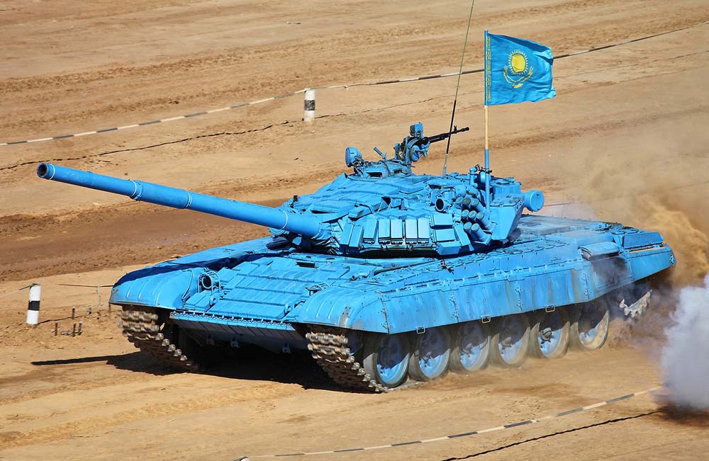
On their tank theres a flag with a ratio 2:3 which loox pretty beautiful. So I just cant get the oficial 1:2 sovietic ratio of shit....
BTW, heres my selection of the 50 MOST BEAUTIFUL flagz
on Planet Earth. Note : NOR politic NEITHER religious criteria
of selection. JUST ONLY beauty + elegance + unicness. ONLY
SUBJECTIVE. It has NO value AT ALL....
Proof #1 NOR
politic NEITHER religious : LIECHTENSTEIN does NOT exist.
It's Heiliges Römisches Reich from
1268, then Werdenberg / Vorarlberg from 1342. FINAL DOT. Yet
I display it because it's beautiful.
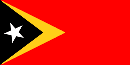
Proof #2 NOR
politic NEITHER religious : TIMOR does NOT exist. It's Indonesia
since the dinosaurs. FINAL DOT. Yet I display it because
it's beautiful.
Selection valid 2024. MARKO's just both a failed artist & a vexillolog of shit for 50 years....
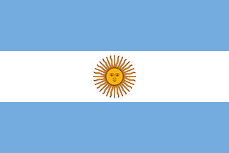

ARGENTINA
ARMENIA
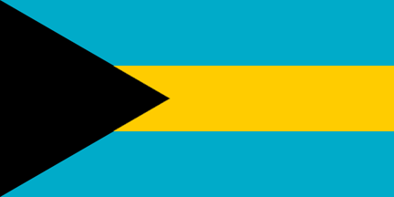
BAHAMAS
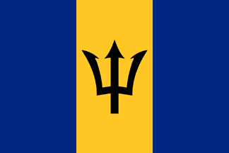
BARBADOS
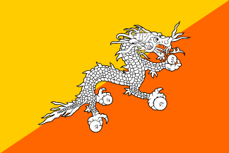
BHUTAN
BOTSWANA
BRASIL
BRUNEI
CABO VERDE
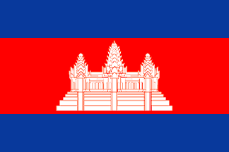
CAMBODIA
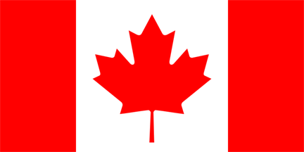
CANADA
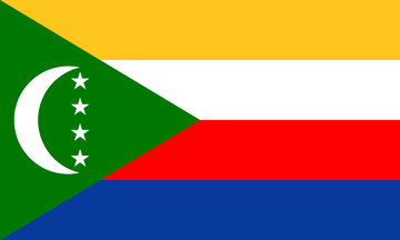
COMOROS
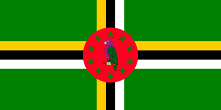
DOMINICA
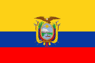
ECUADOR
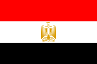
EGYPT

ESTONIA
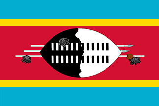
ESWATINI
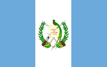
GUATEMALA
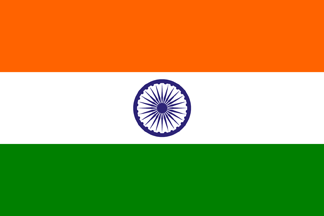
INDIA
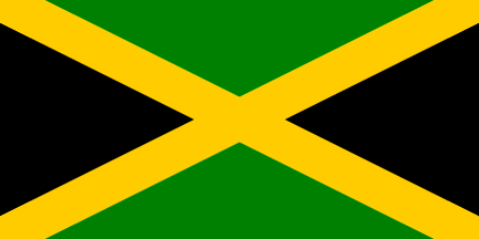
JAMAICA
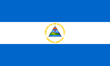
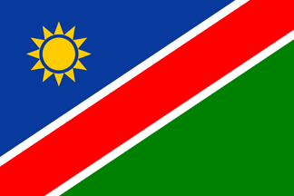
KAZAKSTAN
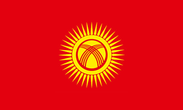
KIRGHIZIA
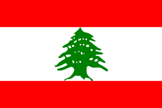
LEBANON
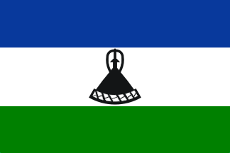
LESOTHO
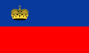
LIECHTENSTEIN
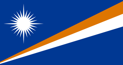
MARSHALL
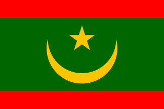
MAURITANIA
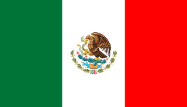
MEXICO
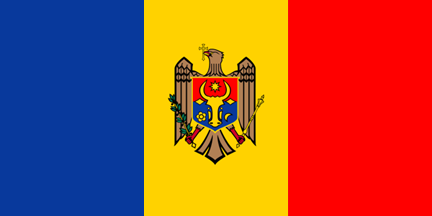
MOLDAVIA
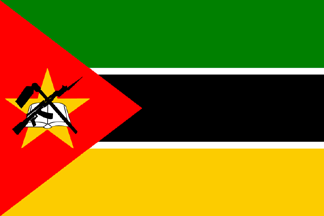
MOZAMBIK
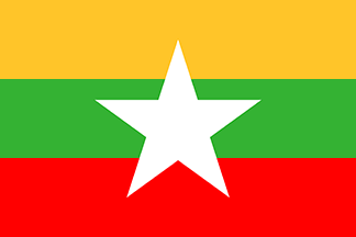
MYANMAR
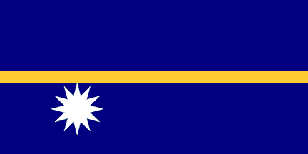
NAURU
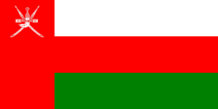
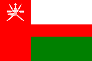
OMAN
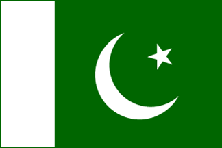
PAKISTAN
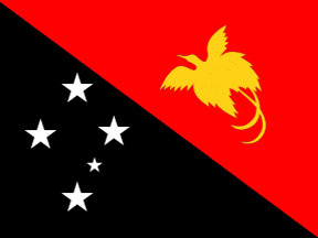
PAPUA
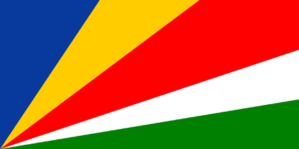
SEYCHELLES
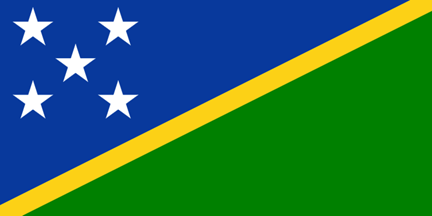
SOLOMON
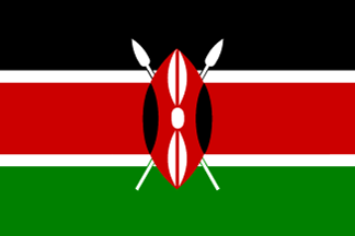
KENYA
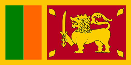
SRI LANKA
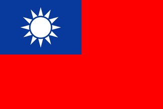
TAIWAN
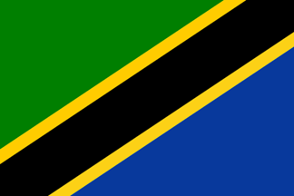
TANZANIA
TIMOR
TRINIDAD
TURKMENISTAN
UGANDA
URUGUAY
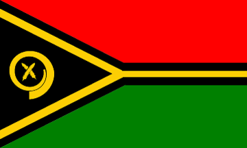
VANUATU
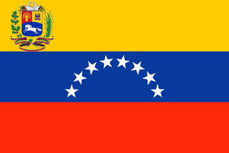
VENEZUELA
LAST NOTE : I will NOT try to
explain how I "work" to select a flag. I L just only say
"magic" VS "not magic"....
If you dont
understand, I L NOT blame you !!!!
BEAUTIFUL BUT NOT MAGIC
BEAUTIFUL BUT NOT MAGIC
MAGIC !!!!!


GOOD
BUT NOT MAGIC
MAGIC
!!!!
It 'd 'v
looked + magic shaded "night blue".

VERY
GOOD BUT NOT MAGIC (BAKER + HOWLAND +
JARVIS)
MAGIC !!!!
NULL
MAGIC !!!!
REPUGNANT & DISGUSTING
MAGIC !!!!!
NULL
MAGIC !!!!
GOOD
BUT NOT MAGIC
GOOD BUT NOT
MAGIC
MAGIC !!!!!
REPUGNANT & DISGUSTING
MAGIC !!!!!

NOTHIN SPECIAL AT ALL
MAGIC !!!!!
NULL
MAGIC !!!!!
NULL
MAGIC !!!!!

NULL
MAGIC !!!!!

NULL
MAGIC !!!!!
NULL
MAGIC !!!!!
NULL
MAGIC !!!!!
NULL
MAGIC !!!!!
GOOD
BUT NOT MAGIC
MAGIC !!!!!
GOOD
BUT NOT MAGIC
MAGIC !!!!!
GOOD
BUT NOT MAGIC
MAGIC !!!!!

UGLY
PIECE OF SHIT
MAGIC !!!!!

UGLY
PIECE OF SHIT
MAGIC !!!!!
GOOD
BUT NOT MAGIC
MAGIC !!!!!